Nowadays, smart phones have become an indispensable object in people's lives. It stimulates the explosive of mobile App in all kinds of app stores. The functional Apps could not only simplifies the fast and hurry life, but also provides a great convenient for people.For designers, they are facing more opportunities and challenges. Every designer dreams of making the best app UI design, as well as the most user-friendly UX design to win this huge market.
The excellent mobile App interface design should have two characteristics: simple, and be easy to use. That is also the responsibility of designers to make such beautiful mobile Apps with great user experience design. The best App UI design should be simple and functional to provide enough information for users by the gorgeous interface design.Also, that’s a key factor to give an impressive visual effect to users and make them stay for it and download it. On the contrary, if the users feel puzzled and don’t understand the design concept, that could be a failed UI design.
To provide more inspirations for the great UI designers, here at Mockplus we listed 5 the best App UI design examples in 2017.
1. Natural Home
Highlights: minimalist style
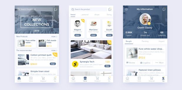
In the case of Minimalist style has been widely used in UI design. Under the precondition of function, many excellent design website and App are advocating to promote the simple design. The interface design of Natural Home is very simple, clear, and the user can understand each of the functional section of the panel, and will not feel incongruity.
2. City Intro Animatio
Highlights: Dynamic visual attraction
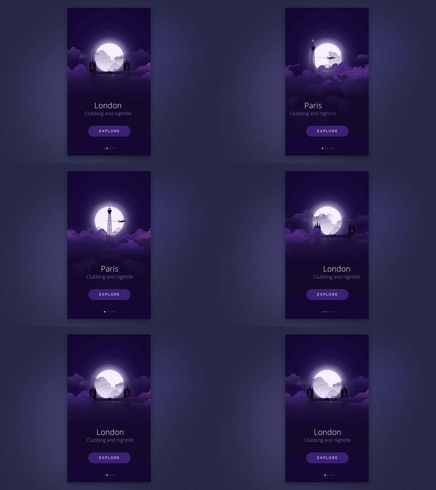
As we all know, UI is not limited to a fixed interface, many UI design has begun through the dynamic form to attract users. From the point of view of interface design, video or dynamic performance forms are more vivid than static images,that will give users more intuitive visual feedback.
3. Events Discover App
Highlights: professional color
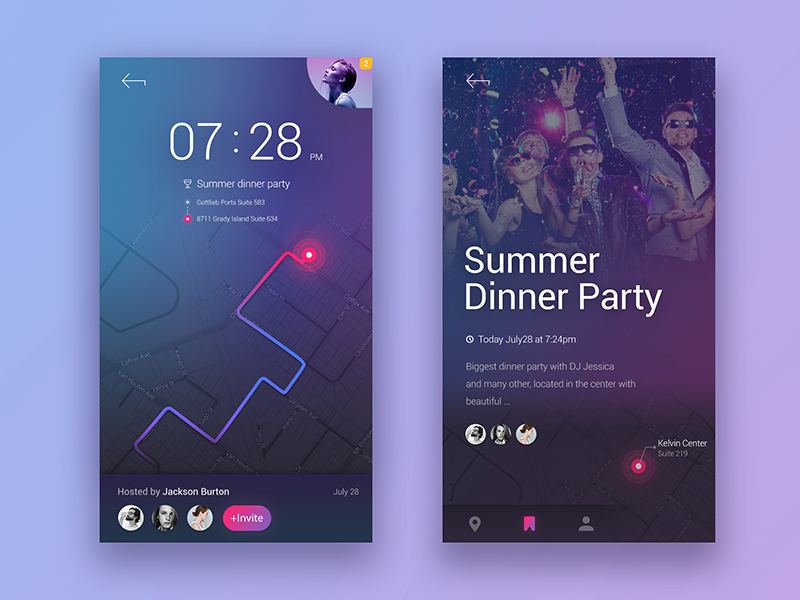
To judge an App’s user interface is beautiful or not, that greatly determined by the color. The App UI design should be good in the visual effect, and comfortable on color, that can greatly optimize the visual experience. The appropriate color effect could produce a shocking visual impact to some degree. In this App, the right color provided users with an impressive visual experience.
4. Intimate
Highlights: Prototype design
Address: http://doc.mockplus.com/?p=744
2017 is easier than ever to bring ideas into life, and the boundaries between UX and UI designers will continually getting blurred, despite the questions of UX is not UI, or UI not equals to UX, etc., are still existed. While the trend is more tending to integrate the design process of UX and UI design. Prototyping design will be a more indispensable part. The emergence of new prototyping tools such as Mockplus, Proto.io will greatly improve the designer's work-flow so that they can spend more time thinking about users than starting from scratch every time.
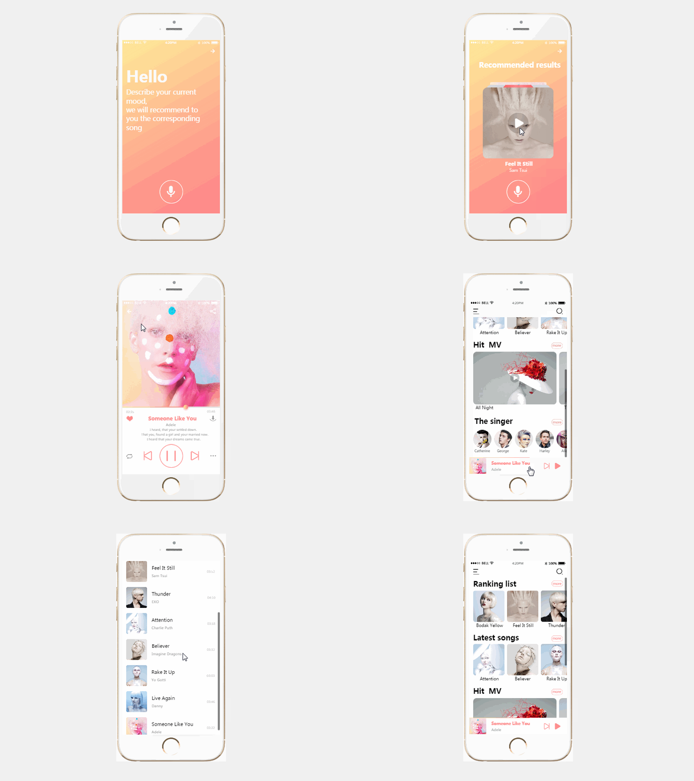
Despite this music app is made by prototyping tool but not the UI design tool. But we can see that more and more design tools are aware of the UX design and UI design at the same time.
5. Marline
Highlights: Clear typography
Address: https: //www.javiperez.net/#marline
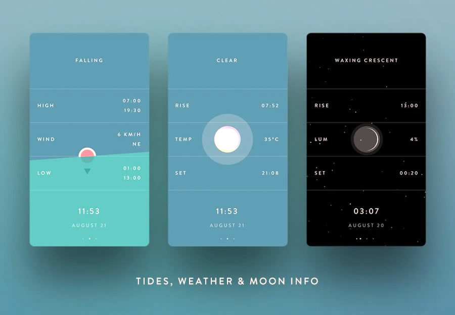
Marline is an App with elegant interface design, and it has very comfortable visual effects. Smooth animations, soothing palettes, and crisp typography allow users to love it at first glance and want to choose it as a daily weather application.
6. Fitness App Chatbot
Highlights: Dialogue interface
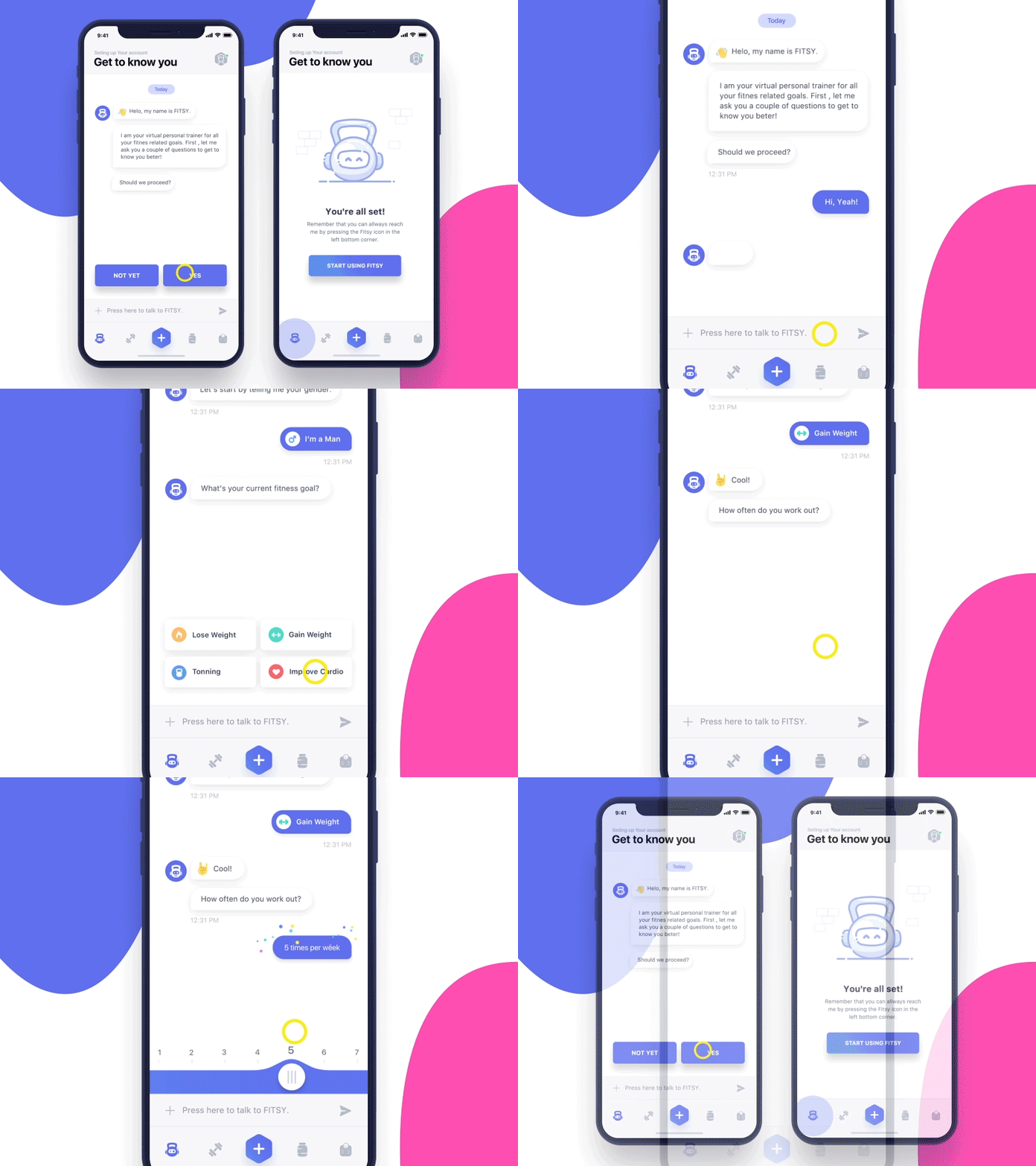
Chatbot technology has been integrated into consumer applications for a long time,which helps to perform and handle common tasks and reduce the burden for users a lot. What makes FITSY different from all the other fitness apps is it's AI/Bot virtual assistant that can assist you in making decisions based on your stats, having all the nutrition and exercise calculations done for you no matter what your level and know how is, and most importantly keep you motivated just like a personal trainer to reach your fitness goals.
7. Weather App Interactions
Highlights: Cards
Cards mode is not a new breakthrough in the app UI design. But for UI design, it’s a very functional design. With the success of mobile app UI design and its integration into Google's Material Design, cards have been prominent in web design. As a widely-used UI design method, it works on a variety of platforms, from smaller screen devices to larger ones. They are a great way to organize and display large amounts of data on the screen at the same time, allowing users to quickly filter available information and choose to view it. Facebook, Twitter, Netflix and Pinterest are all powerful digital platforms, all of them using the form of a card.
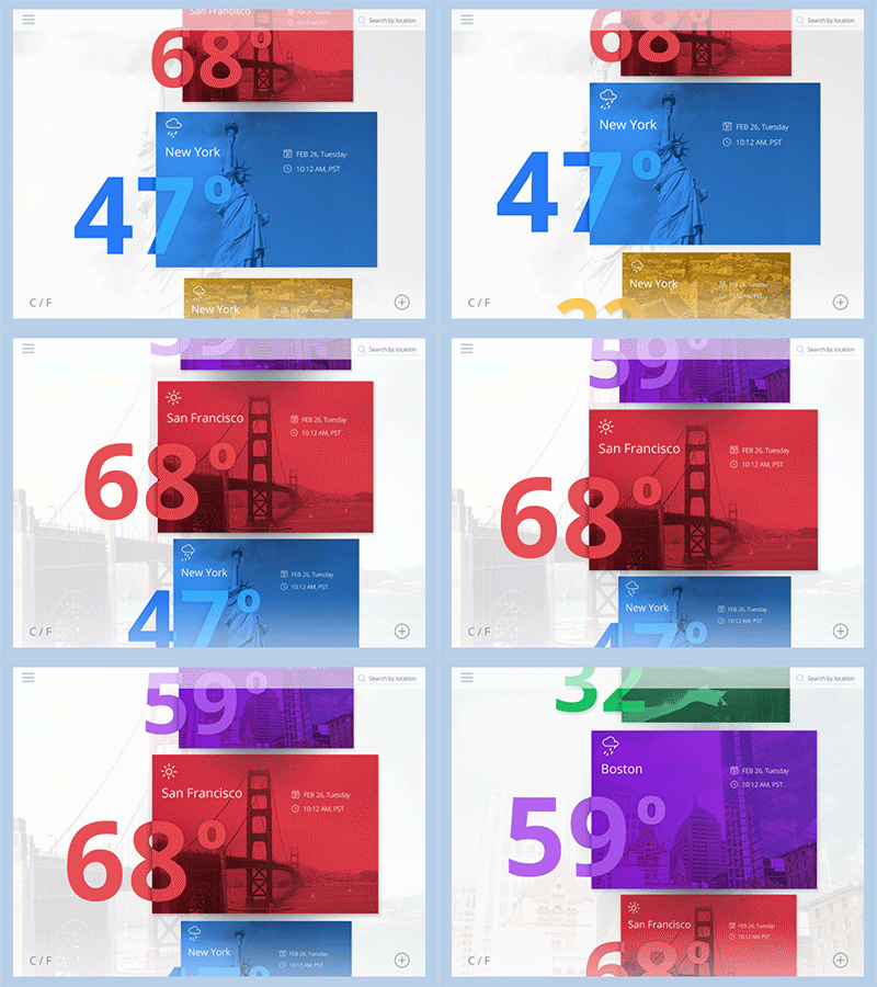
This app was made by Tubik Studio. Rain or shine, the day is fine: here's a new set of iPad interactions for a weather app concept. The data is organized in cards which react on scrolling imitating the physical perspective of close and distant objects.
8. Bullet Journal
Highlights: Micro interactions
Micro interactions play a crucial role in UI and UX design, especially on mobile devices and small screen devices. Smart designers make users happy by implementing functions in a funny way. From fun-loaded animations to sleek icon conversions, effective micro-interaction can both act as a catalyst for attracting and informing users.
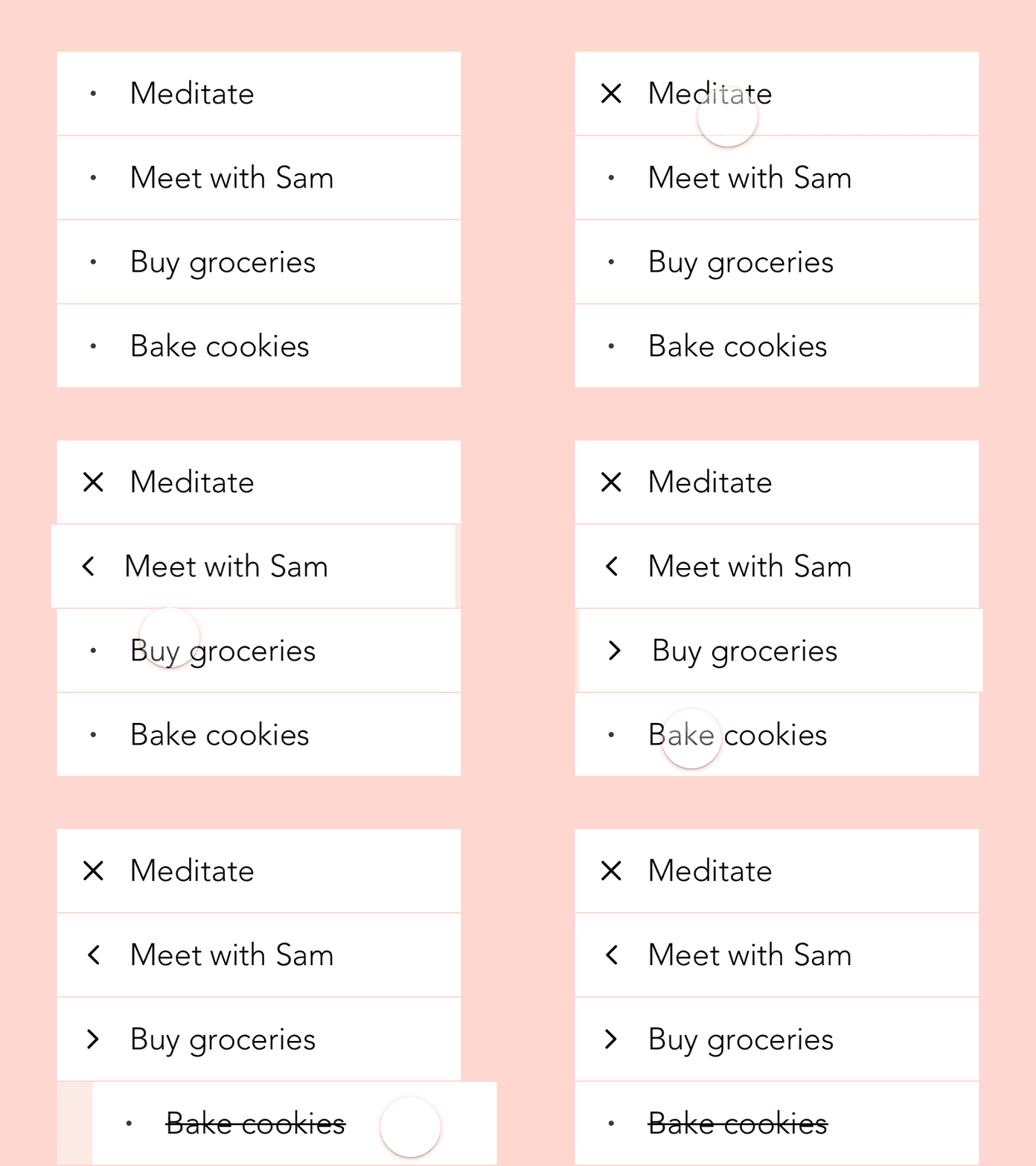
Bullet Journaling is an analog task management and calendar system that makes it easy to to schedule tasks and mark progress. The simple gestures make it looks like for a digital version.
9. QiangChang Music App
Highlights: Paper Design
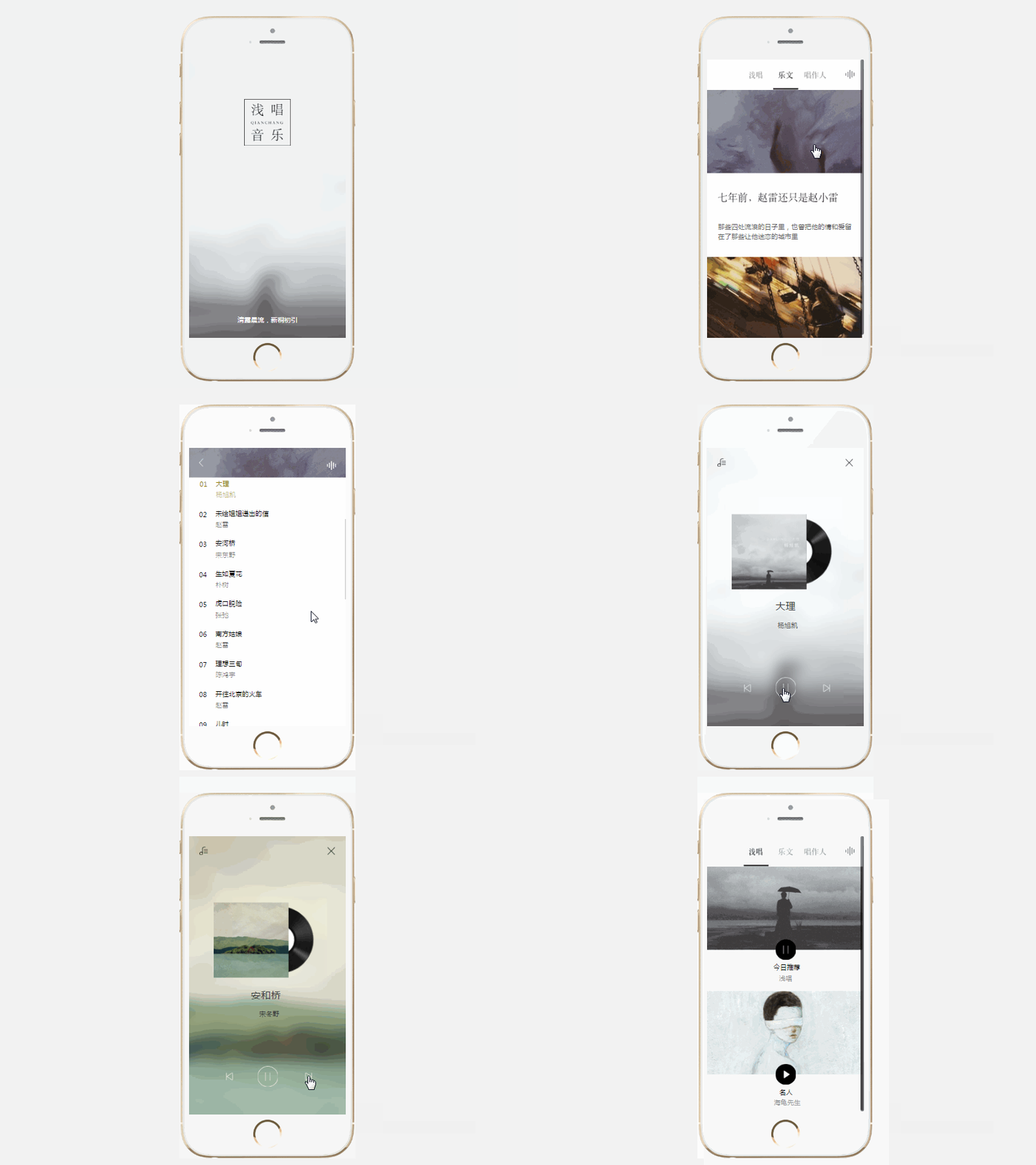
At present, many excellent apps or web design take advantage of the minimalist effect of paper design: Reasonable sense of hierarchy and appropriate segmentation, as well as the selection of dynamic and so on. At the same time, paper design also has a close link with the often used card design.
With the simple and clear paper design interface, the design concept of this music app displays a thinking of only music concerned, and no any other disturbing for users. And with the clear and traditional Chinese style background, it’s very popular by this kind of minority and simplify design.
10. Monthly Data Reports
Highlights: Flat design
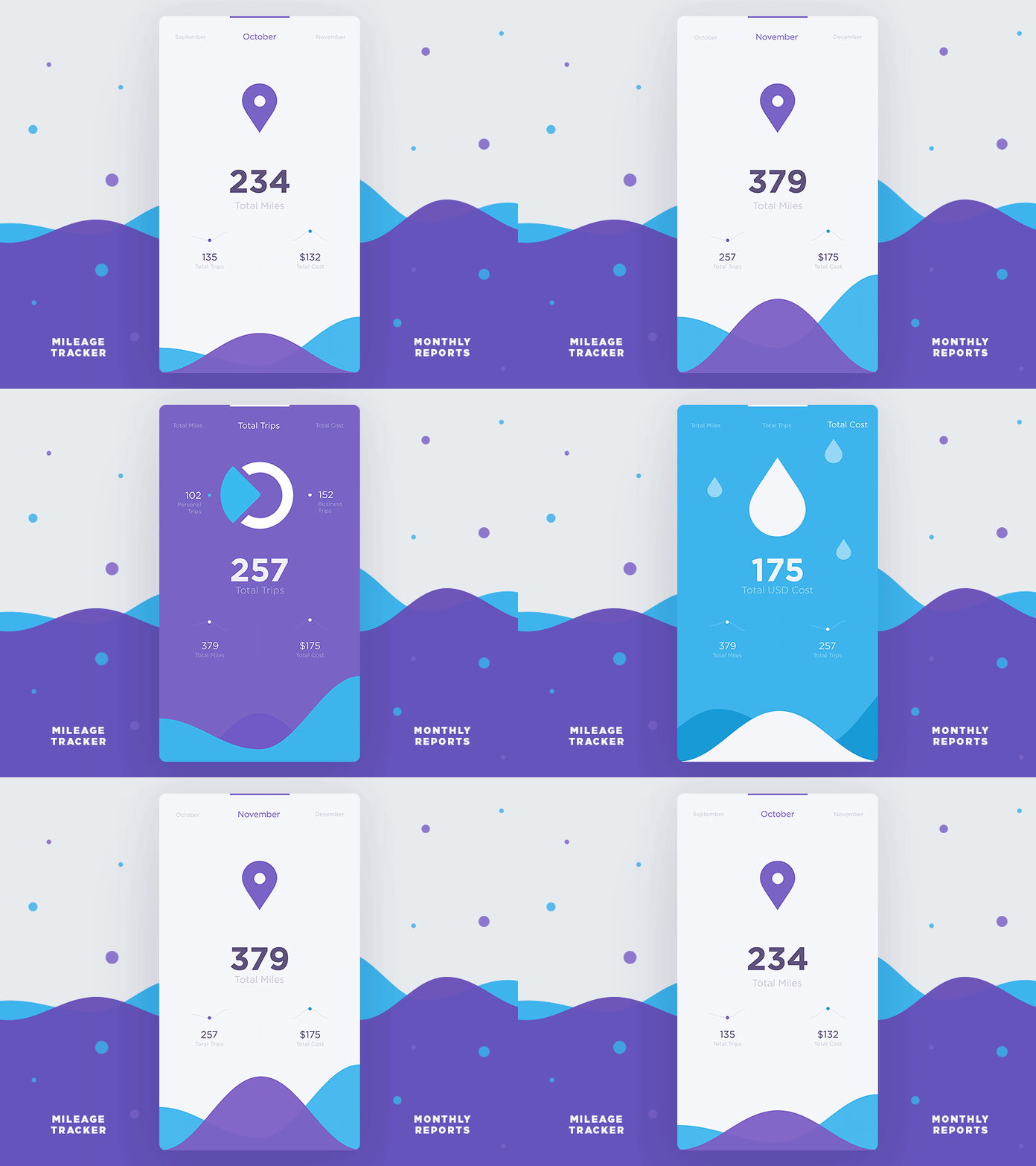
Graphic design aligns with the viewer's emotions and feelings by adjusting shapes, shades, brush strokes and alphabetical spacing of fonts. As the current trend of design, flat design, is also has the same characteristics. In our daily life, the flat design has become the mainstream design direction in web and app UI design, and can even affect the daily decisions in our lives and has the potential to solve problems.
This data report app combined with the elegant flat design and sports data. That brings a fresh feeling to users after sporting to check the data.
The above are the 10 best App UI design examples I collected for UI designers’ inspiration. Now the App UI design technology is constantly improving, all kinds of trends competing. The pursuit of flat design, minimalist style, the pursuit of animation, which are now the most popular UI design trends. However, the most amazing or prototyping design, Mockplus prototyping design is not just to meet the low fidelity, stunning and meticulous high degree of fidelity will make people very unexpected.
Originally posted at:


0 comments:
Post a Comment